Quasar: Pt. 4 — User Experience
Quasar Post-Mortem: Part 4
Below is a summary of the articles in this post-mortem. Although having full context is recommended, the subject matter explored herein covers many disciplines and can be consumed non-linearly. Feel free to jump around to whichever area interests you most:
Uncanny Valley
Art Direction
Developing for DEI
Regional Template System
Standards
Systems Summary
Avatar Samples
Personal Contributions
User Experience
Product Vision: VR users in the same conversation scene as mobile (iPhone X or later).
Explanation: In this example the mobile user is programmatically placed in the (circular) conversation layout. The mobile user is seeing a POV virtual camera stream of the VR avatars from the center point between the iOS user’s (avatar) eyes. Rotating the iPhone also rotates the virtual camera and the avatar “portal” itself, allowing the ability to look at others depending on who is speaking. The mobile user can choose to represent themselves as either an ARKit-driven avatar (sending blendshape values for articulating the face, alongside the voice stream) or as a typical video chat rectangle (not pictured).
Value Proposition:
Transform both digital communication and professional workflows by allowing AR/VR users to interact with remote participants anywhere in the world, as if they were face-to-face, regardless of the device or application from which they are communicating. We believe removing this platform barrier will unlock unprecedented collaborative workflows and communication paradigms.
Professionals using VR to improve workflows, for example architectural visualization, are unable to communicate in realtime, nor share what they are doing in their virtual environment with others, unless they are in the same VR application which explicitly supports these features. Our value is to allow VR users (which are wearing an HMD which obscures their face) to seamlessly call anyone on any device, from web browsers to mobile devices, and vice versa, without removing their HMD.
To reproduce the face-to-face experience, HMD-wearers in particular will require an avatar; one which matches the likeness of the individual as closely as possible to ensure the communication experience ‘loses’ as little as possible in translation. Additionally, non-HMD (e.g. iPhone, web) users can also choose to represent themselves as avatars if they do not feel confident in their appearance (i.e. just rolled out of bed to answer an iOS call from VR user).
Desired Outcome:
Successfully develop an avatar generation application to represent >95% (for starters) of the human population accurately. “Accurately” is defined by the user, by answering the question “Do I feel represented by my visual representation?”, among other feedback questions which will be covered below.
Respecting Privacy
One of the primary concerns for an application like Quasar [which collects as much physical data as possible] is ensuring individuals feel their privacy will be respected, and also that they are not compelled to submit personal data to enjoy the value of the application.
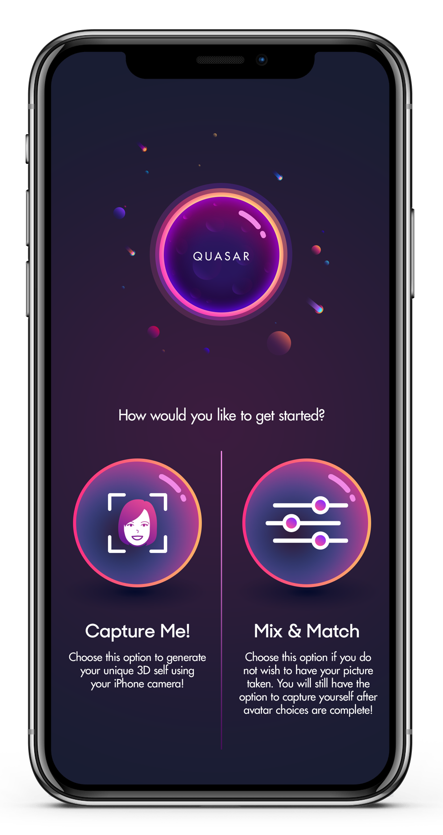
We made sure to provide extremely clear language around Quasar’s data collection, retention and usage in iOS’s permission notification. But for those users who declined to capture their likeness, it required designing a fork in the road -- specifically a user choice at the outset of avatar setup; one which directly asks the user if they would like to have their likeness captured by Quasar. Respecting privacy was important, but I also felt that such an early decision should not impact their ability to change their mind later down the road with minimal friction.
I authored the following user flows to communicate this functionality:
Essentially we allowed the user to begin avatar setup by choosing one of two paths:
Capture Me! — The user is agreeing to have their likeness captured, uploaded, and used to generate a unique avatar.
Mix-&-Match — The user is declining to have their likeness captured, instead opting to rely on a selection of pre-made assets (head shapes, skin tones, glasses, hair, etc) to approximate their appearance without sacrificing privacy
Regardless of which path the user selected, they will always retain the ability to capture themselves and have that data applied to their Mix-&-Match options. One aspect which I always wanted to implement into the application was to allow the user to erase their captured data from their avatar (rather than just recapturing), as well as being able to delete all captured data from the Quasar database. Unfortunately this feature never came to fruition.
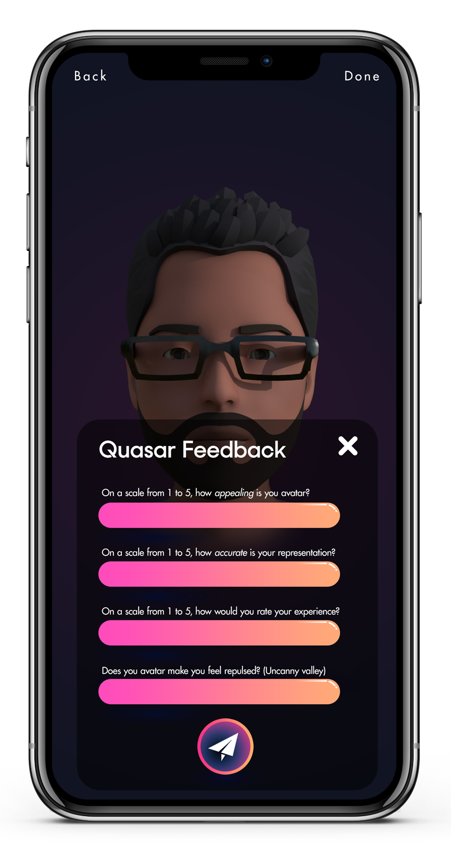
Feedback Strategy / Metrics:
We used questionnaires coupled with renders or live demos of various types of stylization, and varying amounts for each of those stylization types.
Feedback Questions:
How appealing would you rate the appearance of your avatar?
How accurate is your appearance?
Does your avatar make you feel repulsed?
Tester responses were then sorted into ‘appearance buckets’ — this was a mitigating step to ensure a high frequency of similarly-looking people (i.e. non-people of color) wouldn’t result in muting the evaluations from less-common tester appearances (i.e. people of color). This allowed us to make targeted improvements to representation coverage without compromising the experience of those users who were already pleased with their appearance.
Over the course of several iterations we zeroed in on a medium-high fidelity face surface (shape of facial features) with a lower fidelity face texture (color). Below is the end result — each of the following avatars was generated from real people — the first being myself:
Designing for Impatience
One of the most difficult aspects of designing a delightful UX for an application with such an immense amount of runtime data processing is asking the user to... wait — *gasp*.
I recall a study from the early days of broadband access which measured user disengagement vs time spent waiting for a page to load; back then, the average website visitor allowed a site an average of approximately 10 seconds for a page to respond before hitting the back button. I remember thinking this was not much time at all, but then again I was still on a 56k dial-up modem, anxiously awaiting a broadband provider in my area. These days, 47 percent of consumers expect a web page to load in just two seconds or less! While a full 40 percent of consumers will wait no more than three seconds for a web page to load before hitting that back button.
Our patience for unresponsive applications is shrinking over time. Which understandably was a major concern for Quasar -- the average application experience isn’t generating 50+ unique face mesh shapes on the fly, nor is it generating 30+ textures, some of them (such as the head) as high as 2k quality. Designing a delightful UX for an avatar system which processes and generates more data than virtually any other consumer-grade avatar system was going to be a hairy beast to tame.
Naturally the majority of Quasar’s computation time took place immediately after capturing the user’s images and ARKit face mesh. During this time, which ranged from 30 seconds to 2 minutes (depending on asset output resolution), we considered various solutions to keep the user entertained. The best option seemed to be to allow the user to begin the Mix-&-Match process of browsing and selecting premade assets (glasses, hairstyles, etc) while computation took place. This ensured the user was still making progress while waiting for a background process to complete.
The actual implementation of the background processing was extremely onerous to solve. Many signaling and race conditions had to be wrangled across multiple threads and device profiles.
Design Artifacts:
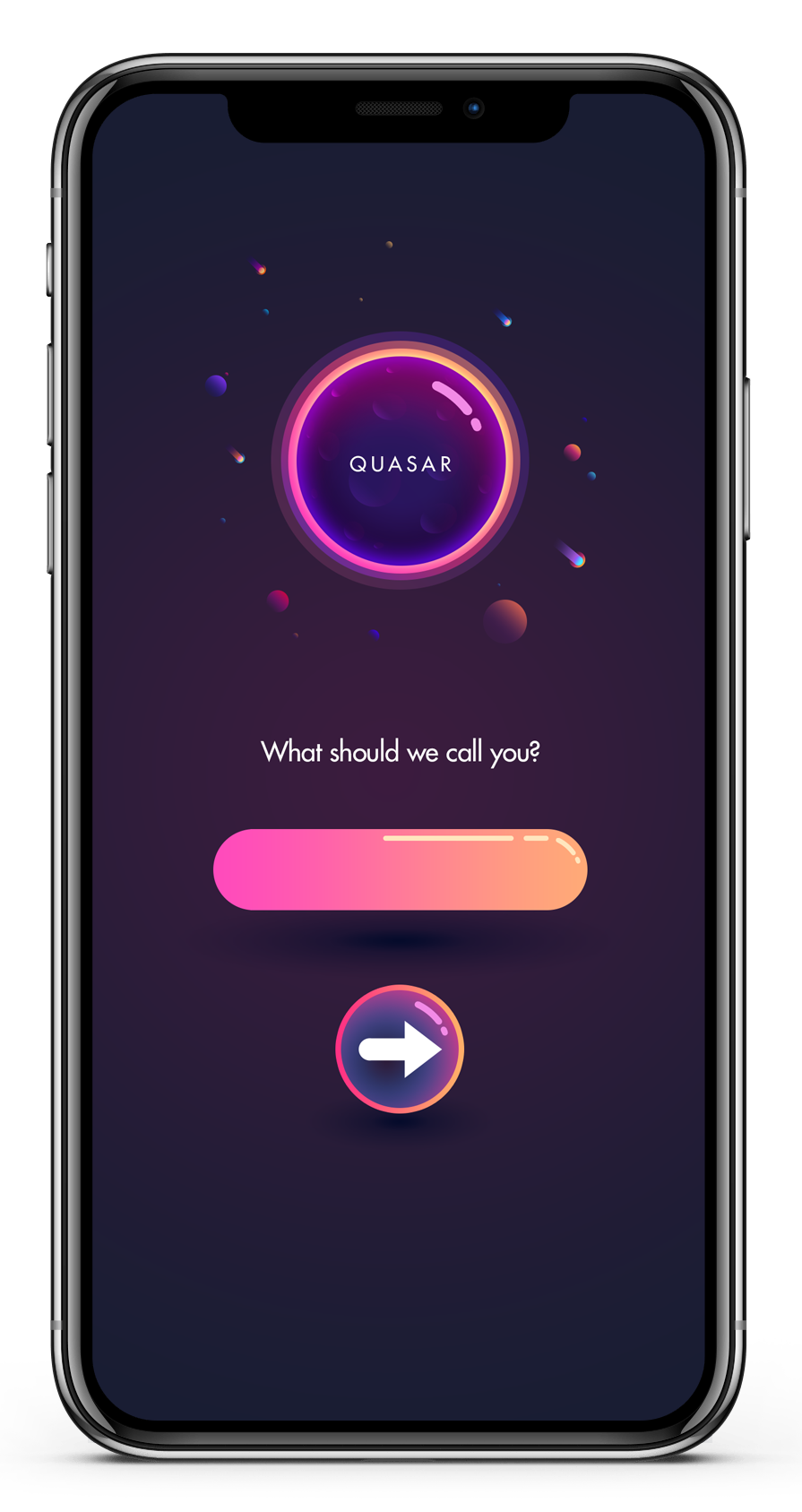
I authored the following artifacts for the team -- please note, some of these are not perfectly inline with the final design of the application. Targeted changes were made which didn’t require generating new artifacts to get the work done. The overall visual style is a bit ‘immature’ in my opinion. If I were to redesign the application I would have preferred a more professional, sleek design with a lighter palette.
Logo:
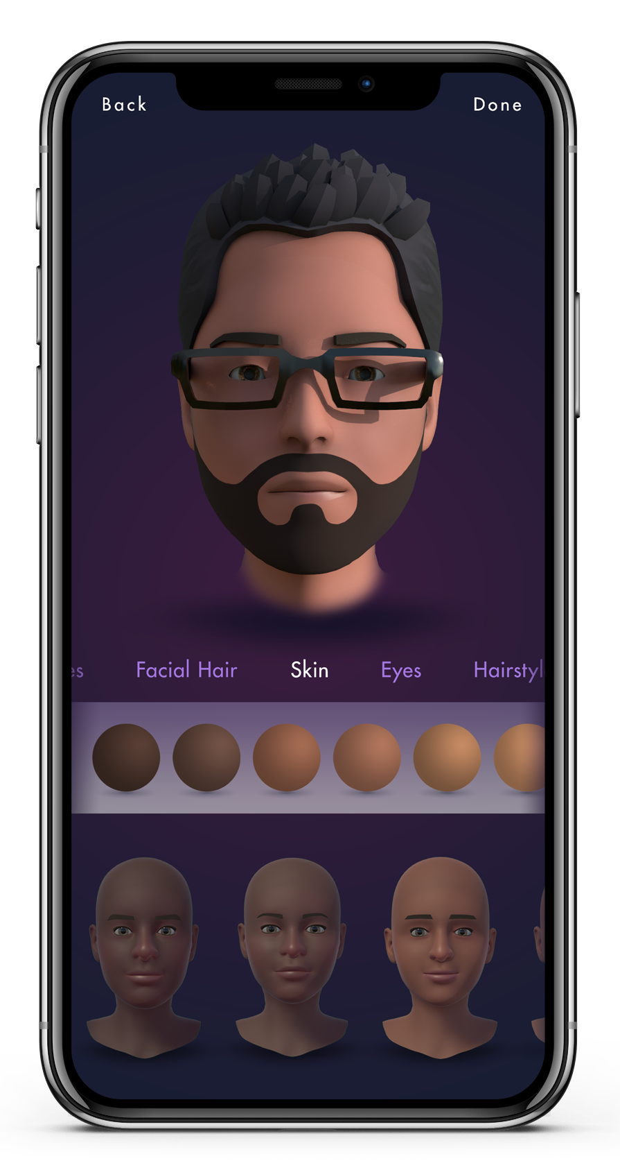
Interface Screens:
Mix-&-Match UI:
The “Mix-&-Match” interface is a fairly typical mobile-device avatar editing interface, although there are some behaviors which are Quasar-specific:
Face/Skin Templates:
Quasar allows for changing the template of an avatar regardless of whether or not you have applied captured data to the avatar model. As was mentioned previously, Quasar’s Regional Template System programmatically measures the delta of facial point locations between the user’s captured face shape and the average face shape of each of the regional templates. RTS does a solid job of selecting the best template, but the user is also allowed to try out different templates as well.
Skin tone is also decoupled from captured data, so no matter which template is chosen, programmatically or not, the user can always change the underlying template and/or the underlying skin tone upon which their captured data was transferred.
Eye Color:
Eyes are an extremely important asset to get ‘right’ -- as they say, the eyes are the window to the soul. The Quasar eye models themselves originally had dedicated geometry for the iris, sclera, corneal bump, and pupil. Unfortunately, due to glTF’s lack of support for transparent “glass” materials, we had to remove the corneal bump. However, the good news is that Khronos Group has recently ratified a glTF extension which finally supports these material types!
Note: These icons are illustrations, rather than renders of the actual eye assets.
Hairstyles:
As noted in the Technical Summary, these hairstyles were made for a much older avatar system prior to my signing on to the company; the models were to be replaced by a Houdini-based hair styling tool which had a great proof of concept, but unfortunately the matured feature never made it into the project. My involvement for these assets was simply making the icons.
Facial Hair:
Quasar allows for the mixing of up to 3 facial hair types at a time. For example, a user may select and combine any moustache, chin, and sideburns style they desire. Facial hair colors can also be combined -- so if the user has dark sideburns with a gray goatee and white mustache, the user will feel represented.
Glasses:
Unfortunately, and as mentioned previously, at the time of development, the glTF 2.0 spec did not support “glass” materials. This meant we couldn’t include lenses on the glasses in a realistic manner.
Note: These glasses models were not created by myself — they are recycled assets from a previous (non-procedural) avatar system developed by others prior to my signing on to create a new system. My involvement for these assets was simply making the icons.
Eyebrows
Note: Again, these (eyebrow) models were not created by myself — they are recycled assets from a previous (non-procedural) avatar system developed by others prior to my signing on to create a new system. My involvement for these assets was simply making the icons.
Uncanny Valley
Art Direction
Developing for DEI
Regional Template System
Standards
Systems Summary
Avatar Samples
Personal Contributions

